There are two ways to define conversion rates. One way is to measure outcomes divided by unique visitors (or separate individuals). Using this method indicates that it is acceptable that a visitor may visit your website repeatedly for research before making a commitment (Kaushik, 2009). Another way is to measure outcomes divided by unique visits. By committing to the latter, you are presuming that each and every unique visit is the opportunity for conversion (Kaushik, 2009). The method you choose to use to measure should depend on your business model.
Outcomes could refer to any number of events. Some examples include subscribing to an RSS feed, signing up for an e-newsletter, download a white paper, registering for a webinar or event, commenting on a blog post, sharing content, or completing a sale.
Comparing your conversion rates to other organizations can be dangerous because, as noted above, conversion rates can be measured differently. It’s best to compare your current conversion rates to your past rates. As Forbes contributor Dave Lavinsky said, “No matter how good your current conversion rates are, they can always get better.”
The KISSMetrics blog highlights a number of ways that companies can test out strategies to improve conversion rates. Below are a few of the easiest ways to improve conversion rates.
This first example highlights the value of testing different
text in order to see which headlines and body copy drive the most conversions. In
order to determine which variable is causing a change (increase or decrease) in
the conversion rate, you need to be sure to only test one variable at a time.
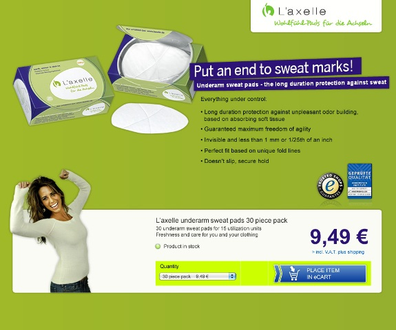
In the first example, the brand L’Axelle uses the phrase “Feel fresh without sweat marks,”
which is a comfort-driven statement. In
the second image, L’Axelle uses “Put an end to sweat marks!” This statement is driven by the problem and
includes an exclamation point.
As you can see, the ONLY change made to the webpage was the
headline. And the action-driven headline
increased conversions by 93% to a total of 33.8%.
Another change that is relatively easy to test is color. Something as simple as change the color of a
call-to-action button can improve the conversion rate. Here’s an example from HubSpot that shows what a change of color can do.
The
call-to-action on the button stayed the same, as did the page design and body
content. The only change was the color
of the button from green to red. The assumption was that the green button would
convert better because it indicates “go,” or forward movement, while the color
red is typically associated with “stop,” or warning. The red button outperformed the green button by 21%.
There are
many more complex ways to improve conversion rates for different outcomes on
your website, but two easy ways to complete A/B testing with headlines and
button colors. This A/B testing will
provide concrete evidence as to which specific elements will increase
conversions.
Offline Reference
Kaushik, A.
(2009). Web Analytics 2.0: The Art of
Online Accountability and Science of Customer Centricity. Wiley. Kindle
Edition.


No comments:
Post a Comment